Home

News

- Current News

- News Archives

- Submit


Information

- About

- History

- Characters

- Weapons

- Enemies

- Levels

- F.A.Q.


Media

- Screenshots

- Downloads


Features

- 1st impressions

- Demo Guide

- The Developers

- Preview

- Inteview


Community

- Mailing List

- Forums

- Fan Art

- Tam Can-Die

- IRC-Info

- Links


Webdog

Recommend this site:

Send message!
   

. . . your source for news and information on Rebel Act Studios' Severance!


Severance/Blade - Hands-On Preview

I've been following Severance/Blade (refered to as Blade from now on) from early in the development, and my interest for the game has only grown bigger for each day. Through the past few years I've made up a pretty clear idea of how Blade plays and what to expect from it. After seeing the last Blade mpeg I was completely hooked; my previous visions of the game was underrated. Working on Blade Universe, for about four months now, have given me even further insight. But it was not until recently, after paying Rebel Act Studios a visit and playing the game myself, I could verify my expectations.

Part 1

Introduction
Interface and Controls
Graphics
Animations
Gameplay
Sound
Conclusion

Part 2

Introduction
Destination: Rebel Act
First Meeting with the Team
Playing Blade and having Lunch
Chatting with the Developers
In and Out of the Glass Room
Talking with Enric
Leaving Rebel Act

When I was there Blade was in the very last stages of development, and only small pieces remained before it was ready for Beta. Still, it is important to remember that what I was testing was work in progress and that certain things are subject to change. Also, the version I was playing was not optimized and the Blade source was changing at least two times during my short stay.

User Interface and Controls
I did not see much of the user interface as most of this was configured in batch-files and through the game console. But what I did see (mainly the main menu and inventory screen) looked clean and slick. Seeing stuff like the options menu would not make much sense as it is not determined what will actually be in it. Still, one really nice feature about the mouse control is worth mentioning. When using the mouse you turn your character by moving it along the X-axis while tilting the camera along the Y-axis. From the options you will be able to adjust the mouse-sensitivity for each axis separately, which enables you to have higher sensitivity along the X-axis for quick turns and lower sensitivity when moving the mouse up and down to prevent you from getting lost in the camera view.

They were, at the time, still working on adjusting the controls. They are trying to minimize the amount of keys as well as working on the mouse controls. I played with the arrow keys for movement: up for walking forward, back for backwards while the left and right arrows was used for turning the character. Double-tapping the up key makes your character run. In combat-mode the left and right keys changed into strafing around the selected opponent. Besides this the most important keys are the attack, defend and action/use keys. The action key is used for picking up objects and manipulating the environment, like pulling levers, unlocking doors and etc. Other useful keys are used for jumping, dropping/throwing objects or weapons, selecting and toggling between opponents.

The first thing I usually do when playing a new game is to customize the keys to fit my likings and what I am used to, so the default controls was a bit uncomfortable. However, I didn't want to spend time changing the set-up; there was more interesting things to see!

When the game starts, a short, scripted, sequence plays out in the game-engine, introducing you to the plot and how you ended up there. There is a different sequence for each of the four characters. Unfortunately the version I was playing was the Spanish one and as my Spanish is extremely limited I didn't understand the dialogue in the sequence, but I enjoyed the visual part - especially the one for the dwarf, who is falling and rolling down a rocky slant. You'll have to see it; it's funny as hell!

Graphics
To understand the amazing graphics in this game, picture this: the intro sequence, that almost looks like it's pre-rendered in a studio, rolls by. You wait for the game to begin and as nothing happens, you start wiggling inpatient with the mouse. To your surprise you find yourself in control of the character. I mean, it's not like the objects and models are better than anything else you've seen in today's games: it's the incredible light and shadow effects that does it, and it really adds that much! Don't get me wrong though, the other graphical elements and the models - both characters and enemies - are all wonderfully done.

Blade uses a portal rendering engine, so instead of using 'brushes' like most other 3d engines; the levels are 'hollowed' out from one gigantic mass. This makes it possible to create large, detailed areas - impossible to achieve with the 'brush'-based engines - without suffering in frame-rates. Moving from tight spots to wide-open areas is practically not affecting the rendering-time at all! Higher resolutions will not have a dramatic effect on frame-rates either, as it is more CPU dependent than it is on the video-card. And in high resolution, d3d mode, Blade truly shines - like a polished gem.

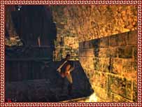
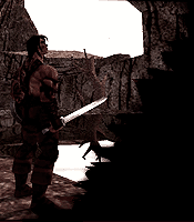
Click to enlarge!One thing that no screenshots can justify is the flickering light; light cast from torches, lamps and candles etc. adds a lot to the atmosphere. In Blade light and shadows works just as in real-life: the only things that are visible are what is hit by light-shed. Everything that blocks light-shed shape shadows on whatever it is blocking the light for. I remember walking into a large open space; a ruin where the roof had collapsed and only some of the walls were intact. The walls behind me covered the sun, so the first half of the floor ahead was covered with shadows. As I moved forward, I noticed a bright square-formed and skewed spot in the middle of the dark portion. With a quick, but certain, swing on the mouse I found myself looking directly at a small window - high up on the wall to the right and back of me. This was the source of the bright area, and by looking at the shape of it, as well as the direction and shapes of the surrounding shadows, I knew exactly where to look the same instance as I spotted it. This adds a wonderful reality feeling to the game, but more important: it aids you in orienting yourself and making out surfaces and objects that you would normally not see from your standing position. I did not see any abnormalities at all in the shadow effects, not in the textures or geometry neither for that matter.

Picking up a torch is simply amazing! Holding the torch in your hand while walking down a corridor creates a huge silhouette of your character on the floor, walls and roof (if the roof is lowered enough). The shadow really gives you a hunting feeling, and sometimes, it scared the living shit out of me; I started swinging at my own shadow, with the torch as a weapon, in a desperate paranoia.

Next Page


Headlines

-End of an era
-Two new fan sites
-Computer Gamers review
-LED development
-Local copy of LED
-Today's reviews
-Reviews update
-Gladiator 0.4
-Level Editor released
-Review at Fragzone
-Danish Review
-They just keep coming...
-Bladex Gladiator mod
-Two more reviews
-Review @ playNOW!
-Review on IntelGamer
-Two new reviews
-Mods
-More reviews
-walkthrough-online.com

Screenshots

Click to enlarge!

If you got the game, which character are you playing?

Sargon (Knight)

Tukaram (Barbarian)

Nagflar (Dwarf)

Zoe (Amazon)

-Rebel Act Studios
-Codemasters
-Friendware Europe
-Blade street team


Webdesign and graphics by Kjerand Pedersen,
Copyright (c) 1999, 2000 Blade Universe.
All Rights Reserved.